Slide Show Shape
The Slide Show Shape resembles a rectangular shape but is specifically designed to facilitate the creation of a slideshow by incorporating a Slide Show Animation.
To incorporate a Slide Show Shape into the design area, follow these steps: click on the “Draw” menu, choose “Slide Show Shape,” then proceed to the design area and draw the shape in the same manner as you would draw a rectangle.
The properties of the Slide Show Shape mirror those of a rectangular shape. Refer to the accompanying screenshot for a visual guide on configuring the shape’s properties:
General TAB
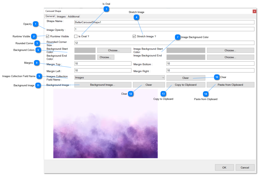
Opacity: Set the transparency of the images displayed within this shape.
Runtime Visible: Indicate whether this shape should be visible during runtime.
Is Oval: When selected, this option transforms the shape from a rectangular area to an oval area for displaying images.
Stretch Image: If enabled, it signifies whether the image should be stretched to fit the assigned area; otherwise, the image is fitted proportionally.
Rounded Corner: Specify the pixel value for rounded corners in the shape.
Background Colors: The overall background of the shape can be filled with a color gradient. Use the “Choose” buttons to select the two colors for the gradient.
Image Background Color: Define the background of the area where the image is displayed inside the shape. A gradient is used, starting from one color and ending in the second color.
Margins: Set the margins for the area where the image is displayed inside the shape.
Images Collection Field Name: Specify the field in the layer containing a list of images. If defined, this field will be used to display a collection of images on the shape.
Clear: Remove the definition of the specified field.
Background Image: Instead of using a color, you can paint the background with an image. Define the background image by clicking the button and selecting an image from your hard disk.
Clear: Remove the defined background image.
Copy to Clipboard: Copy the currently defined background image to the clipboard.
Paste from Clipboard: Paste the image stored on the clipboard to be used as the background image.
Images TAB
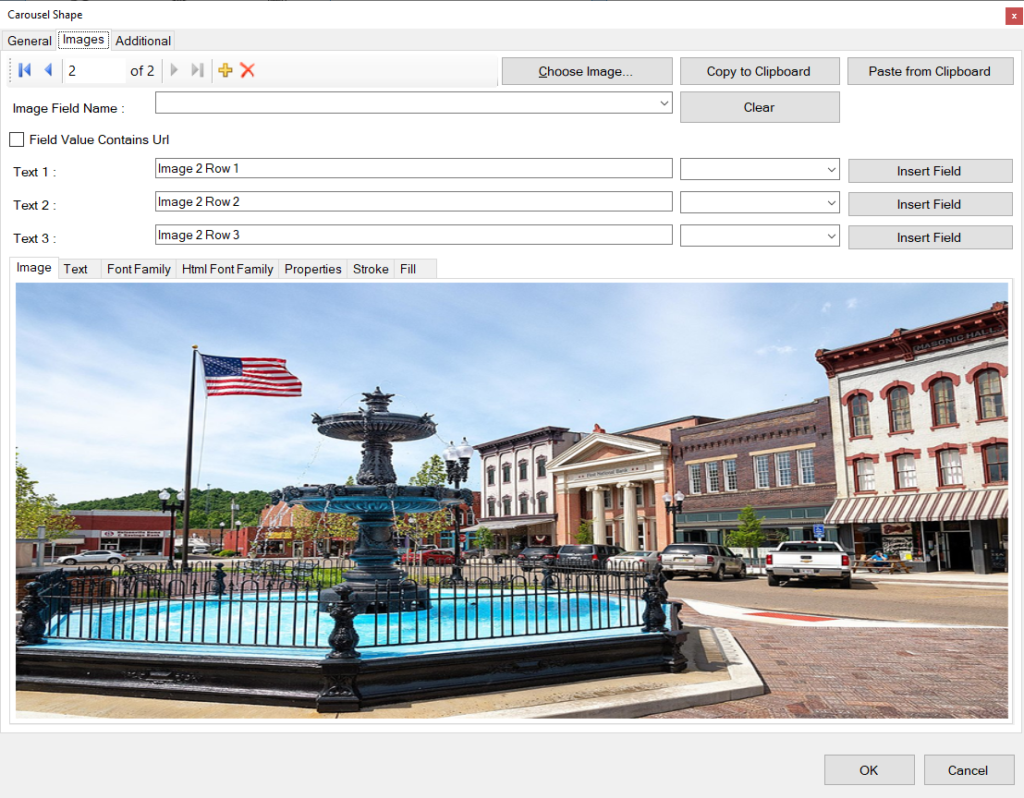
The Images tab contains the following properties. This TAB is used to define the images to show on the animation.
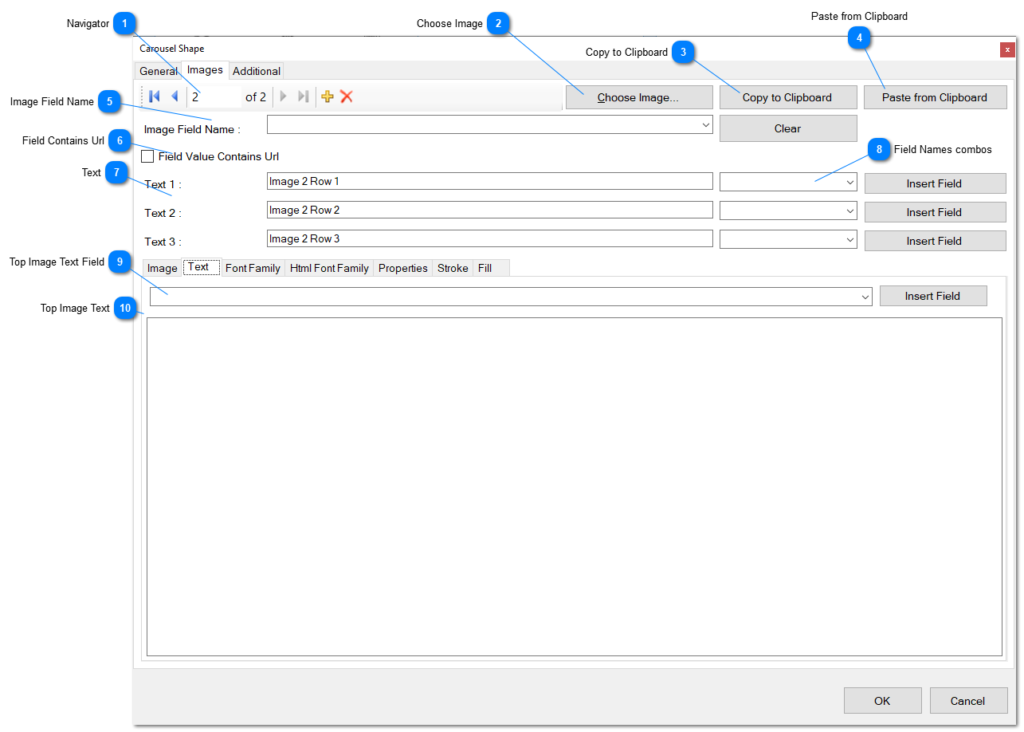
Navigator: The navigator provides functionality to navigate through images, add new ones, or delete existing images.
First button: Click this button to navigate to the first image in the collection.
Previous button: Click this button to move to the previous image in the list.
Next button: Use this button to jump to the next image in the collection.
Last button: Click this button to navigate to the last image in the collection.
Add: Click this button to add a new image to the collection. A Windows Open Dialog will appear, allowing you to choose an image from your hard disk.
Delete: Click this button to delete the current image from the list.
Choose Image: Click this button to replace the current image with another one from your hard disk.
Copy to Clipboard: Copy the current image from the list to the clipboard.
Paste from Clipboard: Paste the image stored on the clipboard into the current record in the list.
Image Field Name: An alternative option to populate the image of this item in the collection. It represents the name of one of the fields in the record of the layer’s list of fields. The field must be either an image field or a string field containing a URL pointing to an image. Click the Clear button to remove the field from the combo list.
Field contains URL: Check this box if the field contains a URL pointing to an image on the web, rather than an actual image.
Texts: Note: applicable to carousel shapes only
Field Names Combos: These combo boxes are displayed only in carousel shapes.
Top Image Text Field: Select a field from the database for every record in the layer to replace the text that goes on top of the image. Use the Insert Field button to insert the selected field into the text editor. Alternatively, the image collection fields include three predefined fields for this purpose.
Top Image Text: Type the text here that you want to appear on top of the image for additional information. Optionally, select a string field from the database record fields.
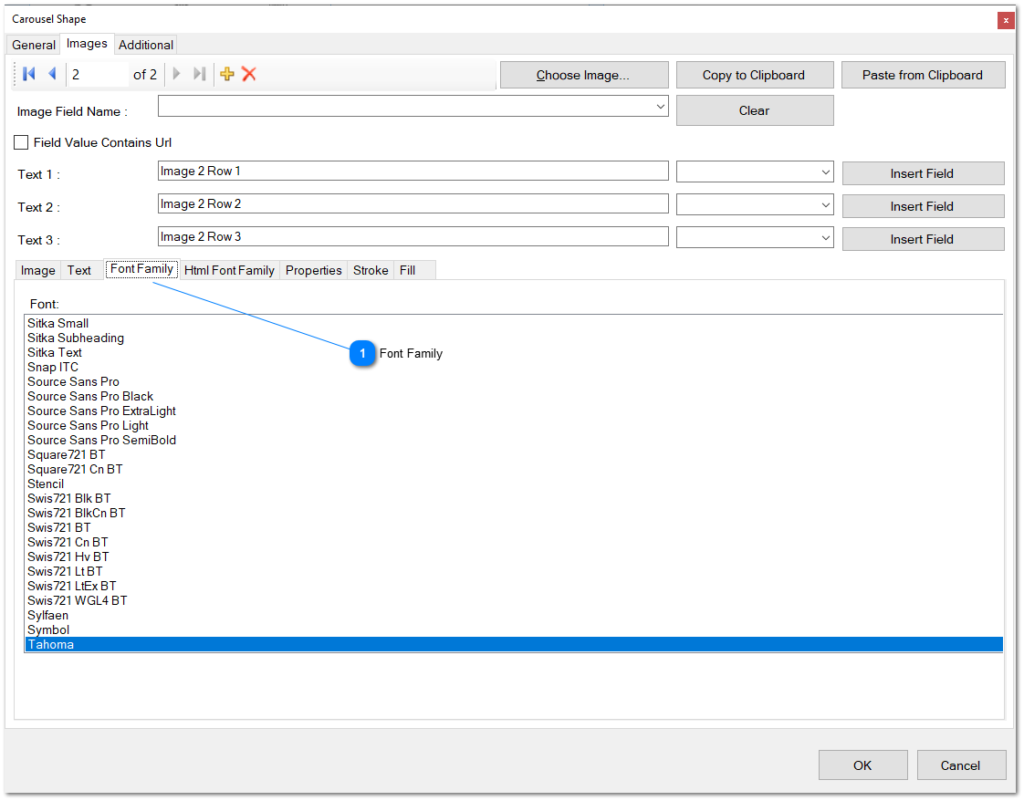
- Font Family.- Select the font family to be used for the main text that is displayed on top of the image. Choose the preferred font style to enhance the visual appearance of the text.
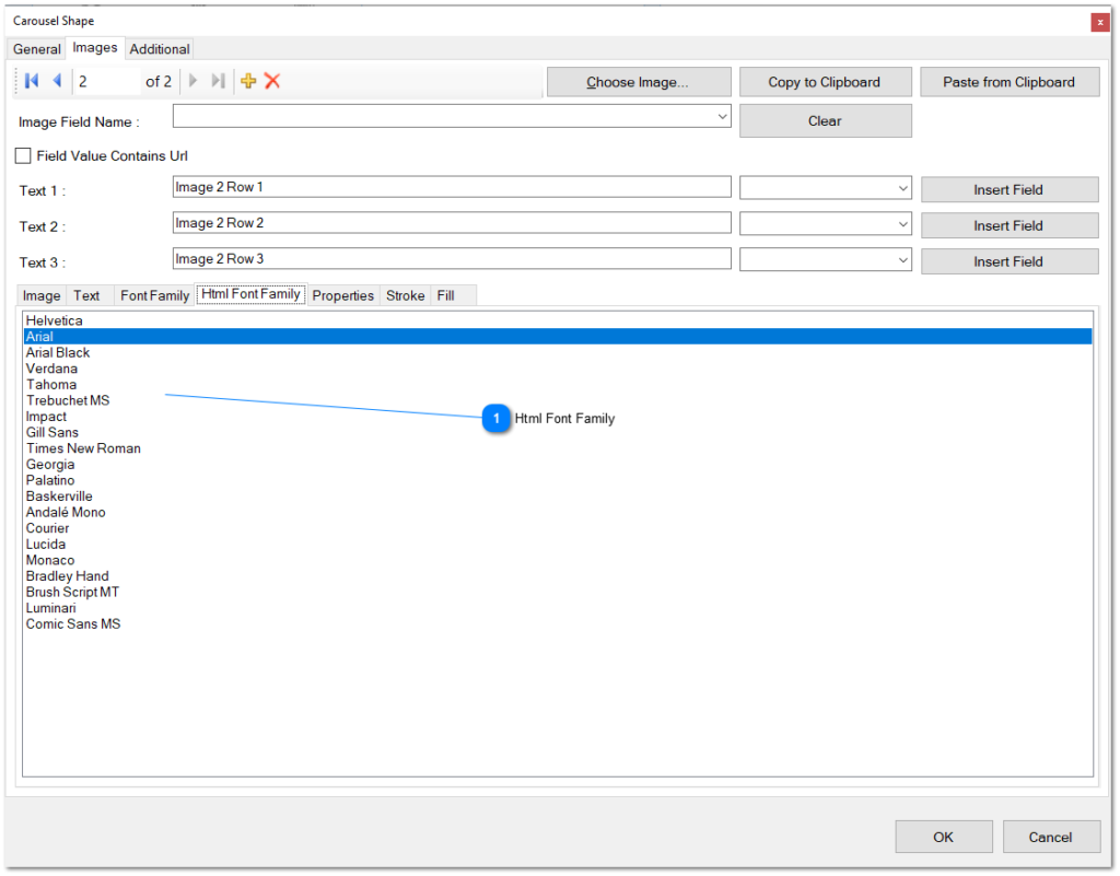
- Font Family.-
Select the HTML font family to be applied to the text on the generated HTML page. Keep in mind that the preview utilizes Windows Fonts, which may differ from HTML Fonts. Choose an appropriate font that aligns with your desired appearance on the HTML page.
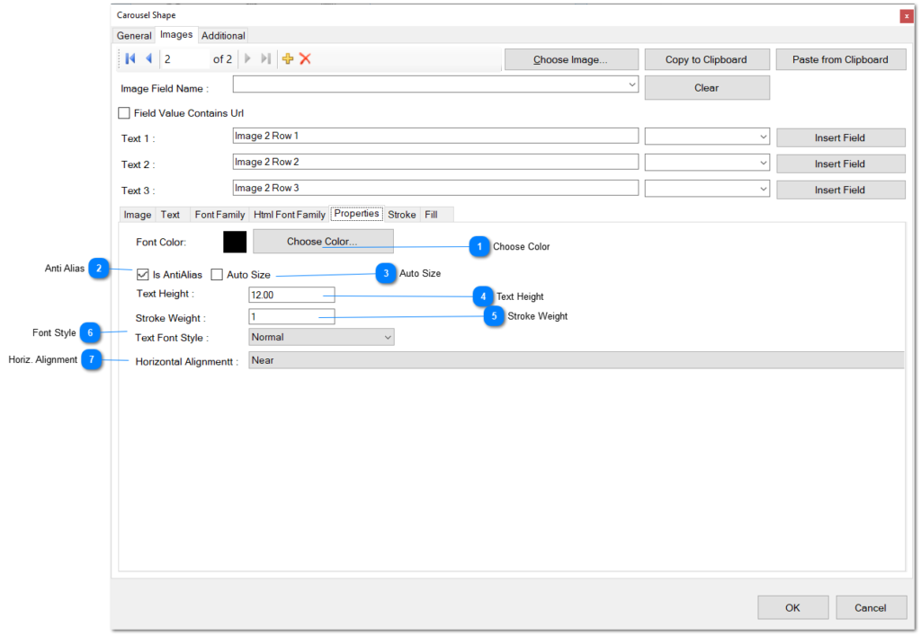
Choose Color: Select the font color for the text.
Anti Alias: Specify whether the text should be painted with anti-aliasing quality.
Auto Size: Determine if the width and height of the text should be automatically calculated based on the content.
Text Height: Define the size of the font in pixels, setting the height of the text.
Stroke Weight: Specify the stroke weight of the text, controlling the thickness of the characters’ outlines.
Font Style: Choose the font style for the text from the combo list, selecting the desired style.
Horiz. Alignment: Define the horizontal alignment of the text by choosing one of the alignment options from the combo list.
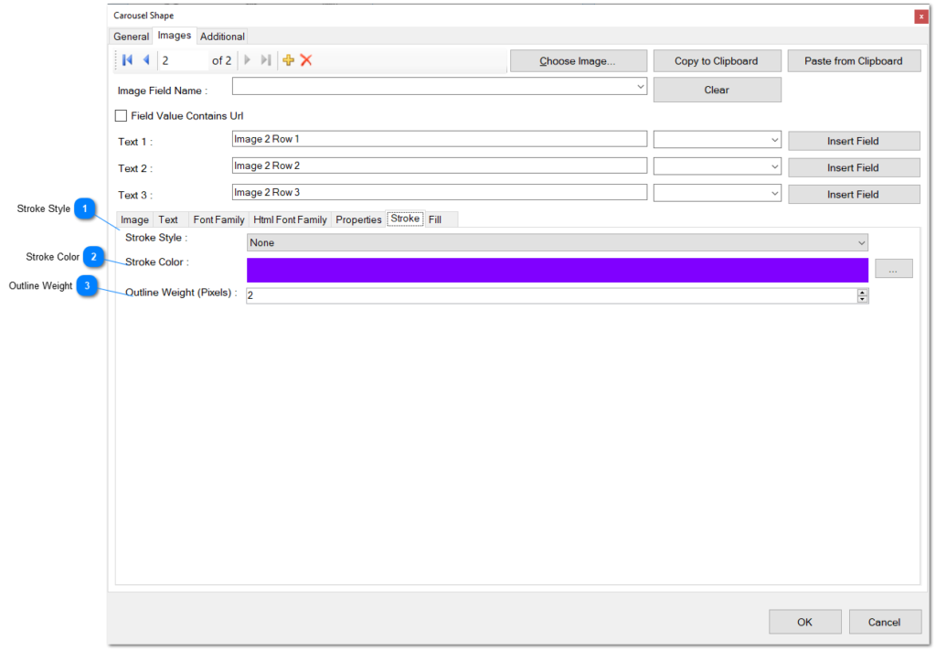
Stroke Style: Select a stroke style for the outline of the image area from the combo list.
Stroke Color: Choose a stroke color for the outline of the image area. Click the ellipsis button to access an appropriate color editor for more options.
Outline Weight: Determine the weight or thickness of the stroke outline for the image area. Adjust this setting to control the boldness of the outline.
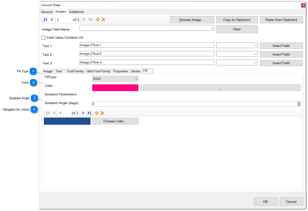
Fill Type: Choose a fill type for the background of the images from the combo list.
Color: Select a color for the background fill of the image. Click the ellipsis button to access a color editor and choose a color.
Gradient Angle: Specify an angle for the gradient fill of the background of the shape, measured in degrees.
Navigator for Colors: Use this navigator to manage a list of colors for the gradient fill of the background of the image area. The navigator facilitates jumping between colors, adding new colors to the gradient, or deleting existing colors.
First button: Click this button to navigate to the first color in the collection.
Previous button: Use this button to move to the previous color in the list.
Next button: Click this button to jump to the next color in the collection.
Last button: Click this button to navigate to the last color in the collection.
Add: Click this button to insert another color into the collection. A Windows Open Dialog will appear to help you choose a color from your hard disk.
Delete: Click this button to remove the currently selected color from the list.
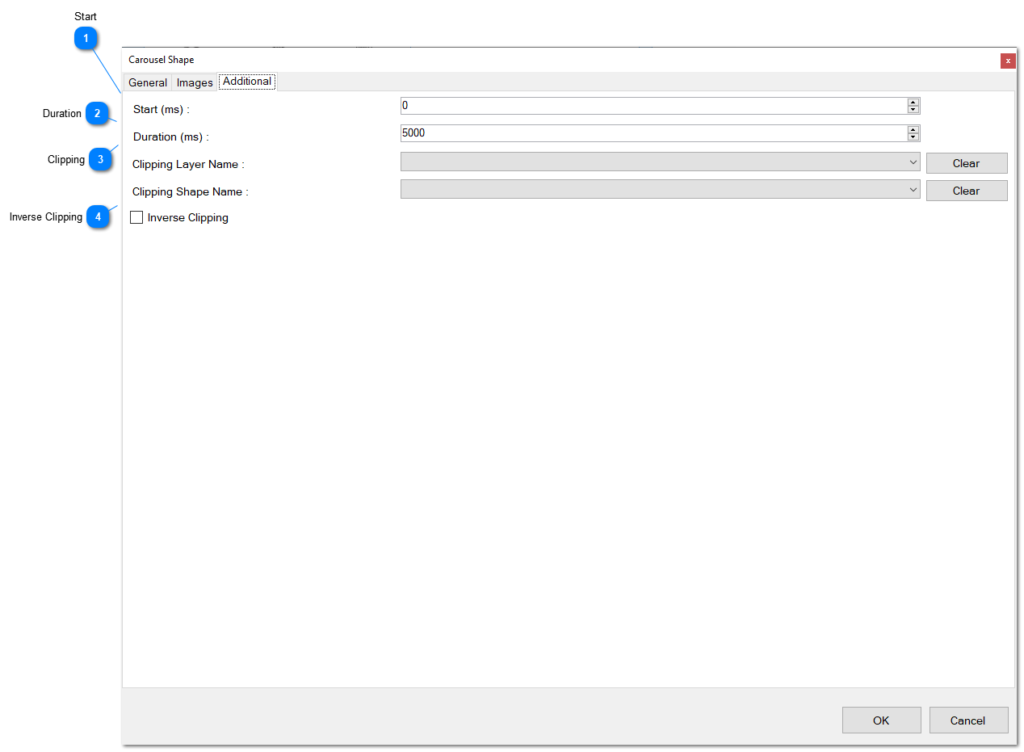
Start: Specify the starting point of visibility for the shape, measured in milliseconds.
Duration: Determine the duration of the visibility of the shape, measured in milliseconds.
Clipping: Choose a layer name and a shape from the combo list to define a clipping mechanism for the shape. The shape will be visible only when inside this specified clipping shape. If the Inverse Clipping checkbox is selected, visibility is limited to the area outside the clipping shape.
Inverse Clipping: If checked, define that the shape will only be visible if it is outside the boundaries of the clipping shape.
Slide Show Animation
The Slide Show Animation applies only to Slide Show Shape. The animation helps you define the transition type between one image and the next or previous one. When you edit this animation, the following screen is opened:
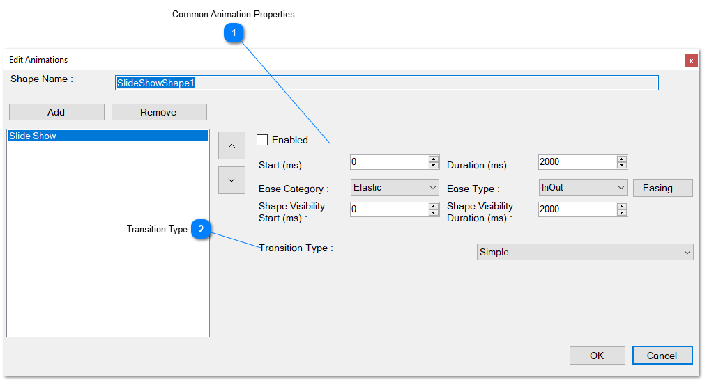
Common Animation Properties: These are the properties common to all animations, as explained in other sections within this document.
Transition Type: Specifies the type of transition between one image and another, with the following options: Elegant, Voronoi, Mosaic, and Simple. The subsequent sections will list any properties required to configure the specific transition.
Elegant Transition
This transition between images does not need to configure any properties.
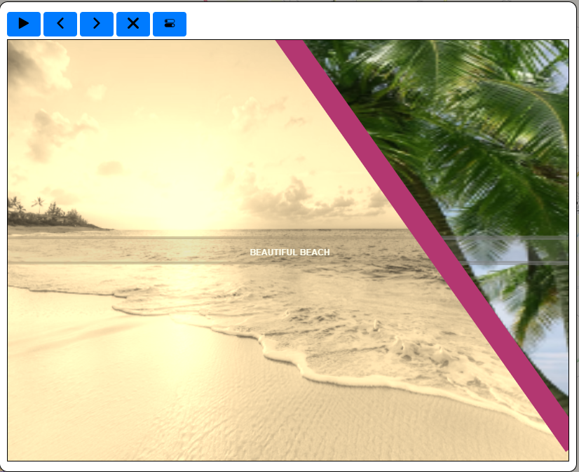
Voronoi Transition
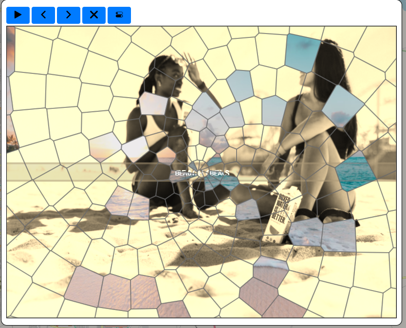
When you choose this transition type, the following properties must be configured :
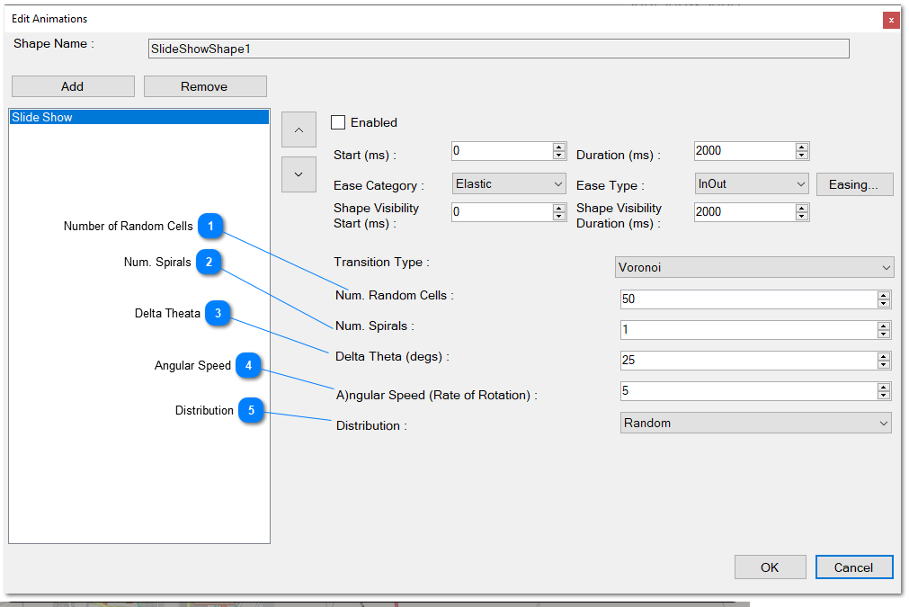
Number of Random Cells: Specifies the quantity of cells for the transition. For example, if set to 50, 50 Voronoi polygons will be created for the transition. The next image gradually appears, showing partially through each polygon.
Num. Spirals: If the Voronoi type is defined to be created using the Archimedes formula, this value determines the number of spirals to create. The Voronoi polygons will follow these spirals.
Delta Theta: This is the angle of rotation for the spirals for every turn, following the Archimedes formula.
Angular Speed: Defines the angular speed, in degrees, of the rate of rotation of the spiral according to the Archimedes formula.
Distribution: Specifies how the Voronoi polygons will be distributed in the Slide Show Shape area. There are two options:
- Random: Voronoi polygons will be created randomly on the area.
- Spiral: Voronoi polygons will be created by following the Archimedes Spiral.
Mosaic Transition
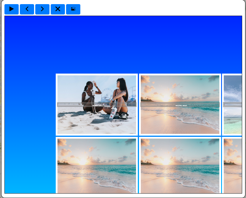
Image showing the Mosaic transition in an html page.
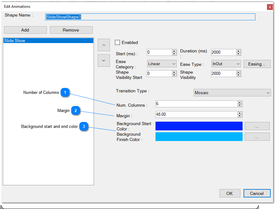
Number of Columns: Specifies the quantity of columns for the mosaic of photos. The number of rows is determined by this value and the total number of photos in the slide show.
Margin: Defines the left margin between each image in pixels.
Background Start and End Color: Specifies the gradient background’s start and finish colors for the mosaic.
Simple Transition
Describes a straightforward transition between each image where the view gradually scrolls either right or left. No additional properties are required for this transition.
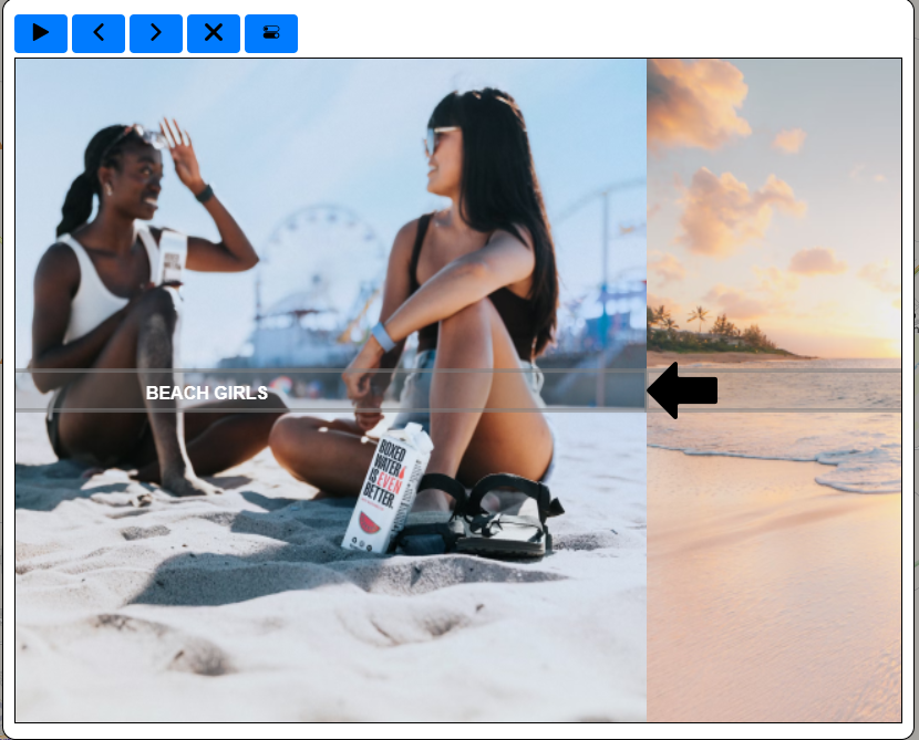
Showing a simple transition in an html page.
In the latest software update, we’ve introduced the option to include more transitions.
Background Slider (new)
You can use the Carousel Shape and Carousel Animation as a Background Slider. This is very useful to create beautiful and dynamic backgrounds for your animation. Check the following Image
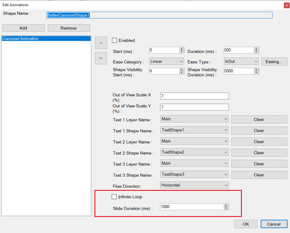
- Infinite Loop.- Check this box in order to use the Carousel Shape as a background slider. When checked, the arrows for changing to the next or the previous image will not be visible, and instead, the image will change automatically and gradually from the current to the next image.
- Slide Duration.- Define here period or range of time, in milliseconds, between each image. This value must be greater than the transition duration defined for the animation. The change of one image to the next one will change automatically without your intervention.
