Carousel
The Carousel is a unique shape designed to display multiple images within a single rectangular area. You can manually navigate from one image to another using buttons on the right and left sides of this shape to move to the next or previous image. Once you draw a carousel shape on the designer area, the following dialog will open. The General tab of the Carousel editor enables you to edit the following properties of this shape:
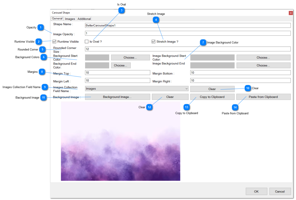
- Opacity.- Define the opacity of the images displayed on this carousel.
- Runtime Visible.- Indicates if this shape is visible at runtime.
- Is Oval.- If checked, an oval area is used instead of a rectangular area to display the images.
- Stretch Image.- If checked, it indicates whether the image is stretched; otherwise, the image is fitted to the assigned area.
- Rounded Corner.- Specifies the value in pixels for the rounded corners.
- Background Colors.- The overall background of the carousel can be filled with a color. A gradient is used to paint the area, gradually changing from one color to another. Click the “Choose” buttons to change the two colors
- Image Background Color.- Defines the background of the area where the image is painted inside the carousel. A gradient is used to paint the area, transitioning from one color to another.
- Margins.- Define the margins of the area where the image is painted inside the carousel shape.
- Image Collections Field Name.- Defines the field in the layer that contains a list of images. These images will be used to show on the carousel if this field is defined.
- Clear.- Clears the defined field.
- Background Image.- Instead of a color, the background can be painted with an image. Define the image here and click the button to choose an image from your hard disk.
- Clear.- Clears the defined background image.
- Copy to Clipboard.- Copies the currently defined background image to the clipboard.
- Paste from Clipboard.- Pastes the current image stored on the clipboard to be used as the background image.
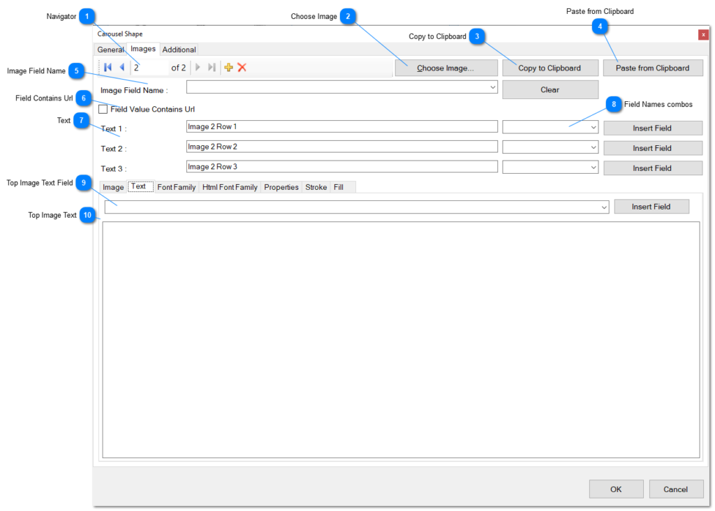
- Navigator.- The navigator is useful to jump from one image to another or to add new images, or delete existing images.
First button.- Click this button in order to jump to the first image in the collection.
Previous button.- Click this other button to jump to the previous image in the list.
Next button.- Click the button to jump to the next image in the collection.
Last button.- Click this other button to jump to the last image of the collection.
Add.- Click this button to add another image to the collection. A Windows Open Dialog will be used to choose an image from your hard disk.
Delete.- The last button is used to delete the current image of the list. - Choose Image.- Click this button in order to replace the current image, from an image on your hard disk.
- Copy to Clipboard.- Copy the current image of the list, to the clipboard.
- Paste from Clipboard.- Paste the image stored on the clipboard, to the current record in the list.
- Image Field Name.- This property is an alternative option to populate the image of this item in the collection and is the name of one of the fields of the record of the layer in its list of fields. The field must be an image field or a string field containing an URL pointing to an image. Click the Clear button in order to clear the field from the combo list.
- Field Contains Url.- Check this box if the field contains an URL pointing to an image on the web, instead of an image.
- Text.- The carousel shape is accompanied by three Text shapes when you add a carousel shape to the design area. The text of these shapes is replaced by the text defined in these properties for the current image. As you move from image to image in the list, the text will change to the text you type here in these three properties. This is the way how it works the carousel shape when playing on the animation, and if you don’t need or don’t want these texts, then you can delete the text shapes from the design area, but could be useful for giving to your customers more information about the current image that is showing in the carousel. Usually these three shapes are placed automatically below the carousel shape, but you can move to another position.
- Field Names Combos.- Alternatively to typing three static texts for every image, you can link the text to text fields in the records of the layer and that way, the text is taken from the values of those fields and replaced in the three text shapes. Click the Insert Field in order to replace the text in the field by the field name meaning that the text will be extracted from the value of the field and set to the string value property for the text shape.
- Top Image Text Field.- The text that goes on top of the image could be replaced by a field from the database for every record in the layer. You can define the field by selecting from the combo list and clicking the Insert Field button, to insert in the text editor. Instead, the image collection fields includes three fields for this purpose.
- Top Image Text.- Type here the text that you want to be painted on top of the image if you need more information for every image. Optionally as said previously, you can choose an string field coming from the database record fields.
Navigator: The navigator is useful to jump from one image to another or to add new images, or delete existing images.
- First button: Jump to the first image in the collection.
- Previous button: Navigate to the previous image in the list.
- Next button: Move to the next image in the collection.
- Last button: Jump to the last image of the collection.
- Add: Add another image to the collection using the Windows Open Dialog to choose an image from your hard disk.
- Delete: Delete the current image from the list.
Choose Image: Replace the current image with another one from your hard disk.
Copy to Clipboard: Copy the current image to the clipboard.
Paste from Clipboard: Paste the image stored on the clipboard to the current record in the list.
Image Field Name: An alternative option to populate the image of this item in the collection. It is the name of one of the fields of the record in the layer’s list of fields. The field must be an image field or a string field containing a URL pointing to an image.
Field Contains Url: Check this box if the field contains a URL pointing to an image on the web, instead of an image.
Text:
- The carousel shape is accompanied by three Text shapes when you add a carousel shape to the design area. The three text shapes are added automatically at the bottom of the carousel.
- The text of these shapes is replaced by the text defined in these properties for the current image.
- As you move from image to image in the list, the text will change to the text you type here in these three properties.
- These three shapes are usually placed automatically below the carousel shape, but you can move them to another position.
- If you don’t need or want these texts, you can delete the text shapes from the design area.
- Useful for providing additional information about the current image showing in the carousel.
Field Names Combos:
- Alternatively, link the text to text fields in the records of the layer.
- The text is taken from the values of those fields and replaced in the three text shapes.
- Click the “Insert Field” button to replace the text in the field by the field name.
- The text will be extracted from the value of the field and set to the string value property for the text shape.
Top Image Text Field:
- The text that goes on top of the image can be replaced by a field from the database for every record in the layer.
- Define the field by selecting from the combo list and clicking the “Insert Field” button.
- Alternatively, the image collection fields include three fields for this purpose.
Top Image Text:
- Type here the text that you want to be painted on top of the image if you need more information for every image.
- Optionally, you can choose a string field from the database record fields.
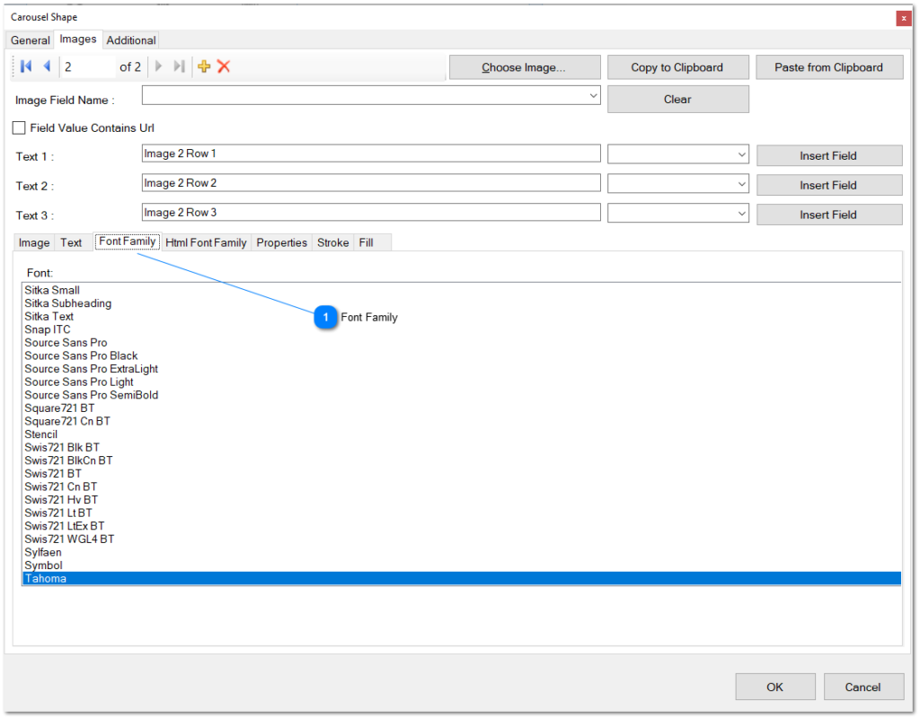
- Font Family.- Choose the font family to use for the main text that goes on top of the image.
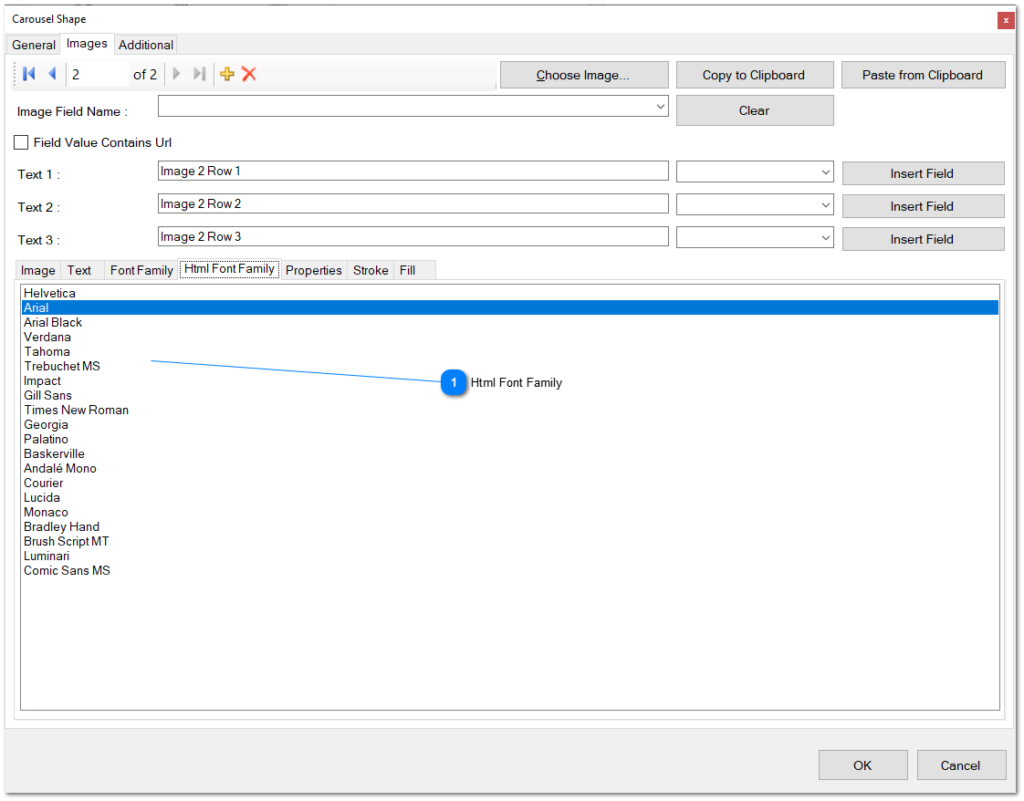
- Html Font Family.- Choose the HTML font family to be utilized for the text on the generated HTML page. It’s essential to select an appropriate font as the preview uses Windows Fonts, which may differ from HTML Fonts.
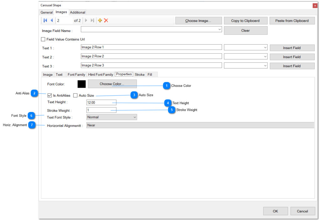
- Choose Color: Select the color of the font.
- AntiAlias: Determine if text is painted with antialias quality.
- Auto Size: Indicate whether the width and height of the text are calculated based on the width and height of the text.
- Text Height: Set the size of the font in pixels.
- Stroke Weight: Define the stroke weight of the text.
- Font Style: Specify the font style of the text. Choose the desired style from the combo list.
- Horizontal Alignment: Set the horizontal alignment of the text. Choose one of the alignments from the combo list.
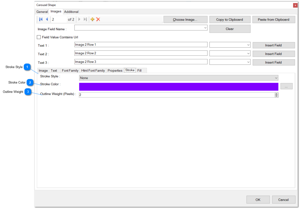
- Stroke Style: Choose a stroke style for the outline of the image area from the combo list.
- Stroke Color: Choose a stroke color for the outline of the image area, or click the ellipsis button to choose from an appropriate color editor.
- Outline Weight: Choose the weight of the stroke outline for the image area.
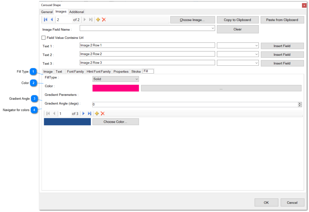
- Fill Type: Choose a fill type for the background of the images from the combo list.
- Color: Choose a color for the background fill of the image. Click the ellipsis button to choose a color from a color editor.
- Gradient Angle: Type an angle for the gradient fill for the background of the carousel shape in degrees.
- Navigator for Colors: Use this navigator to populate a list of colors for the gradient fill of the background of the images area. The navigator is useful to jump from one color to another or to add new colors for the gradient or delete existing colors.
- First button: Click this button to jump to the first color in the collection.
- Previous button: Click this button to jump to the previous color in the list.
- Next button: Click this button to jump to the next color in the collection.
- Last button: Click this button to jump to the last color of the collection.
- Add: Click this button to add another color to the collection. A Windows Open Dialog will be used to choose a color from your hard disk.
- Delete: Click this button to delete the current color from the list.
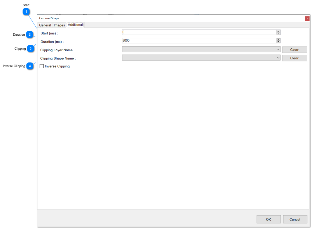
- Start: Defines the start of visibility for the carousel shape in milliseconds.
- Duration: Defines the duration of the visibility of the carousel shape in milliseconds.
- Clipping: Defines, from the combo list, a layer name and a shape used to clip the carousel shape. The carousel shape will be visible only when inside this clipping shape or outside if the Inverse Clipping checkbox is checked.
- Inverse Clipping: If checked, defines that the shape will be visible only if outside of the clipping shape.
Carousel Animation
The Carousel Animation is only valid for Carousel Shapes. When you add a carousel animation to a carousel shape, the following editor can be used to configure the properties of the animation:
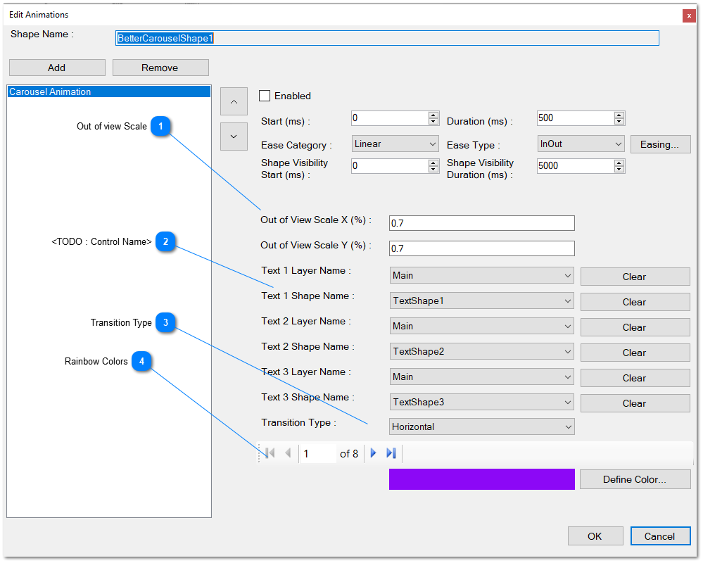
- Out of View Scale.- This means the scale in both axes (in percent) that the image will finish when changed to the next or previous image.
- Text Shapes.- Define the layer and shapes for the three texts that appears initially below the carousel shape. You can use these shapes in order to show information coming from fields in the corresponding record of the database. You define in the first combo the layer of the shape, and in the second combo, you define the text shape name where the value of the fields area displayed. These fields are defined in the carousel shape. The Clear button can be used to undefine the text shape and then, the corresponding field will not be displayed.
- Transition Type.- Choose the transition type from the combo list, existing: Horizontal.- Where the current image scrolls to the left and the next image enters from the right side of the image area. Vertical.- Where the current image scrolls to the bottom and the next image enters from the upper side of the image area.
- Rainbow Colors.- Define here the colors used for the rainbow transition: The navigator is useful to jump from one color to another color or to add new colors to the list, or delete existing colors. Note: this transition was changed to the Slide Show animation in the last version.
First button.- Click this button to jump to the first color in the collection.
Previous button.- Click this other button to jump to the previous color in the list.
Next button.- Click the button to jump to the next color in the collection.
Last button.- Click this other button to jump to the last color of the collection.
Add.- Click this button to add another color to the collection. A Color Dialog will be opened to choose a color from a range of options.
Delete.- The last button is used to delete the current color of the list
Background Slider (new)
You can use the Carousel Shape and Carousel Animation as a Background Slider. This is very useful to create beautiful and dynamic backgrounds for your animation. Check the following Image
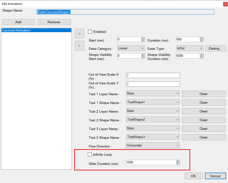
- Infinite Loop.- Check this box in order to use the Carousel Shape as a background slider. When checked, the arrows for changing to the next or the previous image will not be visible, and instead, the image will change automatically and gradually from the current to the next image.
- Slide Duration.- Define here period or range of time, in milliseconds, between each image. This value must be greater than the transition duration defined for the animation. The change of one image to the next one will change automatically without your intervention.
