Buttons
By utilizing buttons, you will be fully equipped to perform an array of actions on the animation. These actions include jumping to the previous or the next page, jumping to a specific page, jumping to a URL, replaying the animation, and much more.
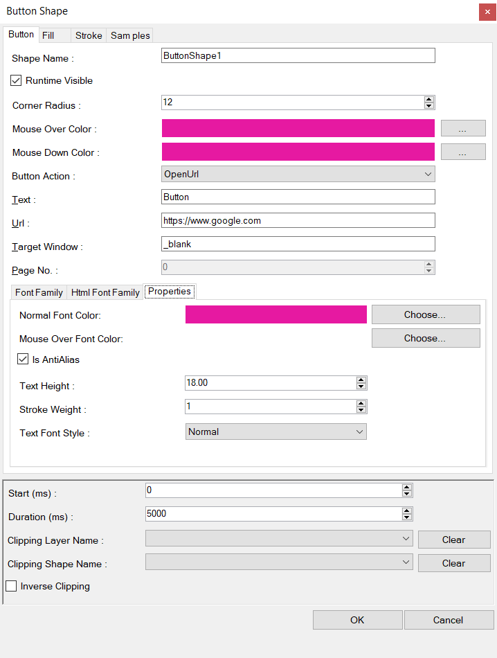
The button shape editor will allow you to edit the properties of the button (only the properties which are different of the common properties are listed) :
- Corner Radius.-The radius of the rounded corner of the button.
- Mouse Over Color.- The color of the button when the mouse is over the button.
- Mouse Down Color.- The color of the button when the mouse button is pressed.
- Button Action.- The action when the button is clicked : Prior Page jump to the previous page, Next Page jump to the next page of the animation, Jump to Page jump the animation to the n page (defined by the Page Number field), Go to Url open the browser with the page in the Url field, Replay causes to start the animation from the beginning.
- Text.- Is the text of the button.
- Target window.- Define if to open the url at a blank page or to another tab.
- Font Family tab.- Define here the font used to paint the button on the screen.
- Html Font Family.- Choose the font family of the button in the html page.
Properties TAB
Defines the properties of the font with which the text of the button is painted.
- Normal font color.- Define the color of the font when the mouse is not over the button.
- Mouse Over Font Color.- Defines the color of the text when the mouse is over the button
- Text Height.- Defines the height of the text in points.
- Text Font Style.- Defines the style of text: normal, bold, italic.
Fill TAB
Defines the fill color of the button when the mouse is not over the button
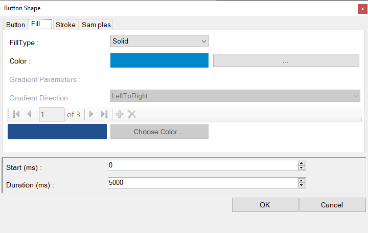
Stroke TAB
Define the outline color of the button.

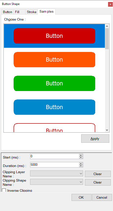
Samples TAB
The samples tab will allow you to define a template for your button. Basically, there are 15 to 20 sample buttons configurations. If you choose one of the button in the list, click the Apply button in order to copy the colors of the chosen button for your edited or new button. Basically, the normal, mouse over and mouse down colors are copied to your button.
Adding a Button shape
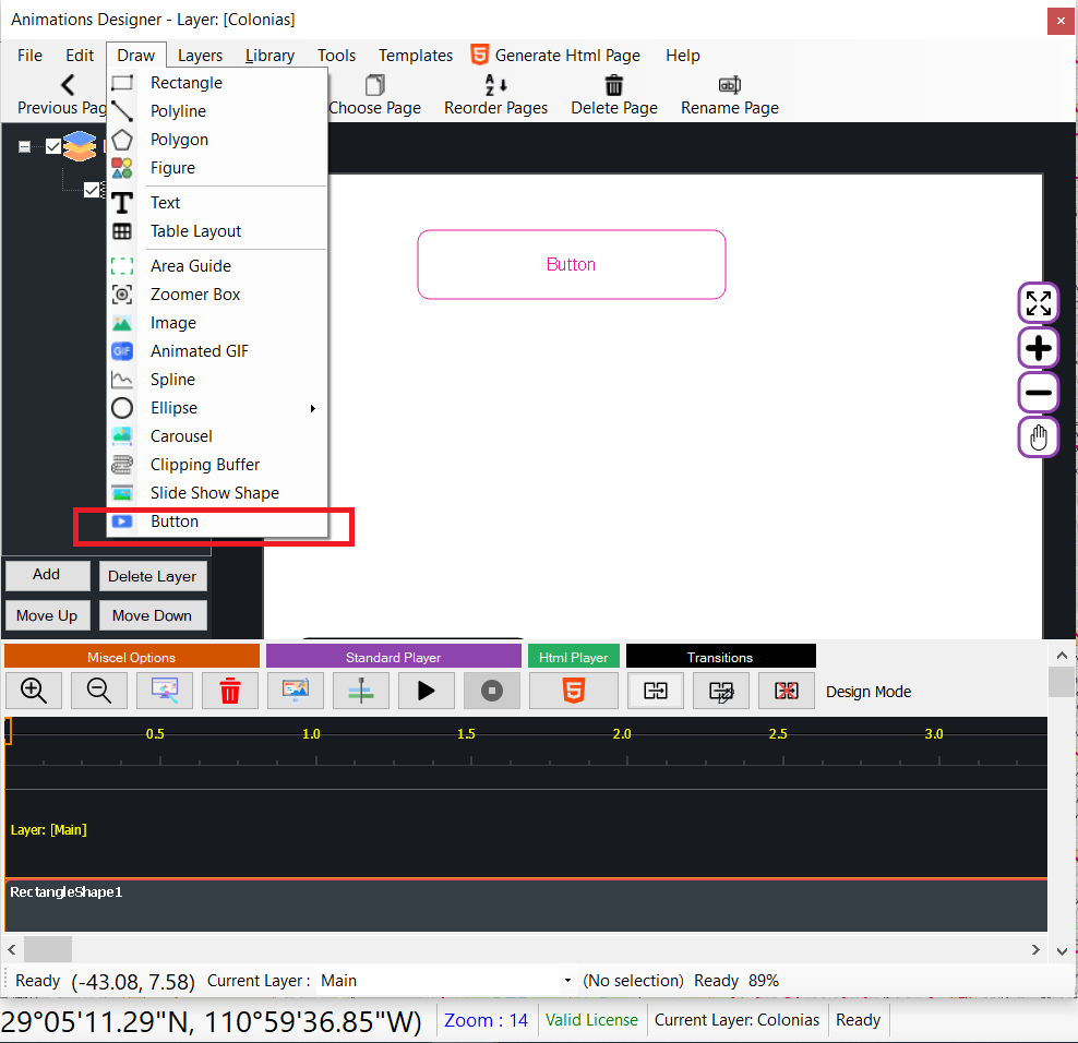
In order to add a button shape to the design area :
- Click on the Draw => Button menu option.
- Go to the design area and draw the button by clicking on one of the first corner of the button.
- Move the mouse to the opposite corner and click again.
- The button is added to the designer.
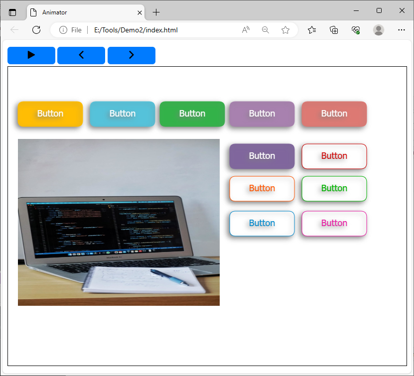
Above, sample of several buttons on an html page.
